package com.codename1.ui
Main widget package containing the component/container “composite” similar both in terminology and design to Swing/AWT.
Component/Container Relationship
Containers can be nested one within the other to form elaborate UI’s. Containers use
com.codename1.ui.layouts to arrange the components within. This is important
as it allows a container can adapt to changing resolution, DPI, orientation, font size etc.
A container doesn’t implicitly reflow its elements and in that regard follows the direction of AWT/Swing. As
a result the layout can be animated to create a flowing effect for UI changes. This also provides improved
performance as a bonus. See this sample of Container animation:
Form hi = new Form("Layout Animations", new BoxLayout(BoxLayout.Y_AXIS));
Button fall = new Button("Fall");
fall.addActionListener((e) -> {
    for(int iter = 0 ; iter < 10 ; iter++) {
        Label b = new Label ("Label " + iter);
        b.setWidth(fall.getWidth());
        b.setHeight(fall.getHeight());
        b.setY(-fall.getHeight());
        hi.add(b);
    }
    hi.getContentPane().animateLayout(20000);
});
hi.add(fall);
You can learn more about layout managers com.codename1.ui.layouts and about
event handling com.codename1.ui.events.
Component Gallery
The component gallery below isn’t complete or exhaustive but it should give you a sense of the types of widgets available within Codename One in a glance.
AutoCompleteTextField
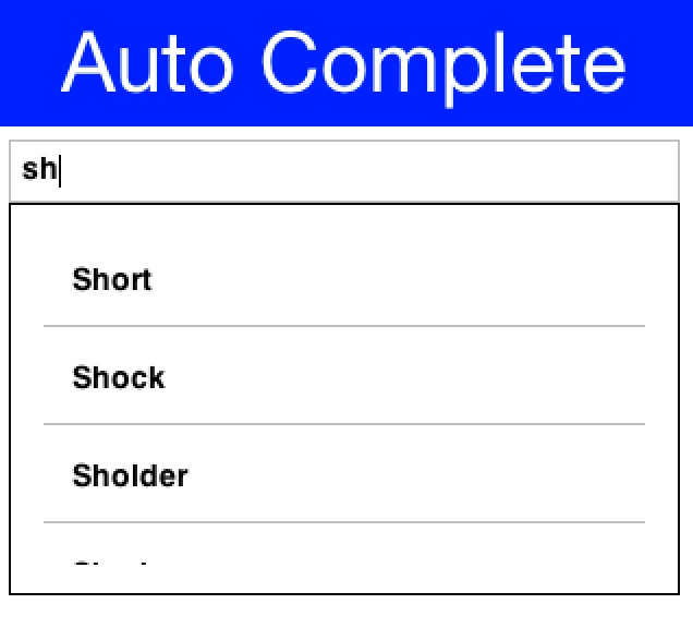
com.codename1.ui.AutoCompleteTextField provides suggestions as you type into the text
field
BrowserComponent
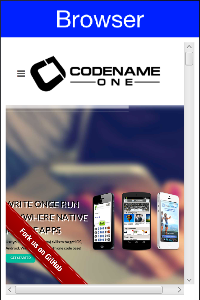
com.codename1.ui.BrowserComponent allows us to embed an OS native browser into the app and
connect to its JavaScript runtime!
Button

com.codename1.ui.Button allows us to bind events to a click
Link Button

com.codename1.ui.Button can also be used as a hyperlink
Calendar

com.codename1.ui.Calendar presents a visual date picker. Notice that we recommend using
the
com.codename1.ui.spinner.Picker class which is superior when running on the device for most use cases.
CheckBox

com.codename1.ui.CheckBox provides a check flag to tick on/off.
com.codename1.ui.RadioButton provides an exclusive check marking that only applies to one radio within
the group.
Both can also appear as toggle buttons
ComboBox
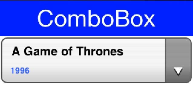
com.codename1.ui.ComboBox is a list with a single visible entry that can popup the full
list. Notice that we recommend using the
com.codename1.ui.spinner.Picker class which is superior when running on the device for most use cases
Command

com.codename1.ui.Command & com.codename1.ui.Toolbar provide deep customization
of the title area and allow us to place elements in the side menu (hamburger), overflow menu etc.
ComponentGroup
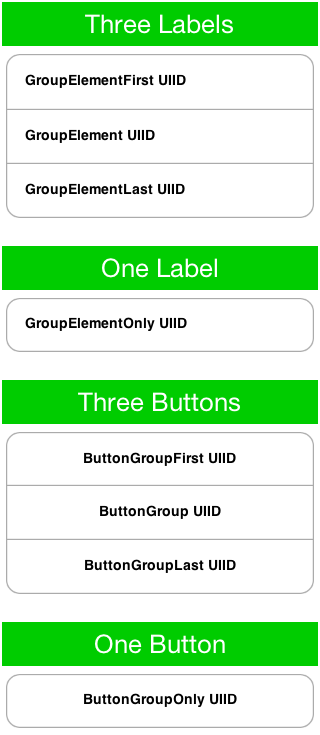
com.codename1.ui.ComponentGroup allows us to group components together in a a group and
manipulate
their UIID’s.
Dialog
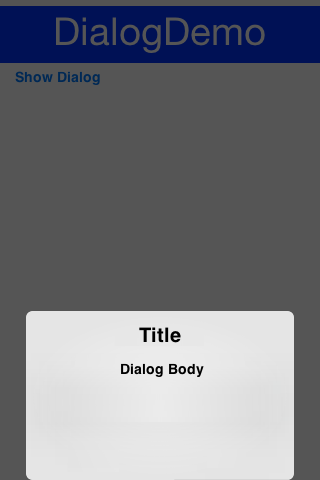
com.codename1.ui.Dialog allows us to notify/ask the user in a modal/modless way.
InfiniteContainer
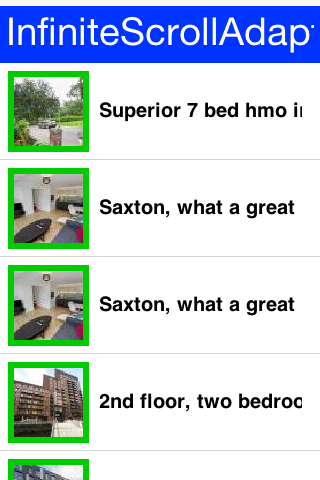
com.codename1.ui.InfiniteContainer & com.codename1.components.InfiniteScrollAdapter
implement a com.codename1.ui.Container that can dynamically fetch more data
Label
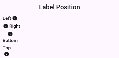
com.codename1.ui.Label displays text and/or icons to the user
List
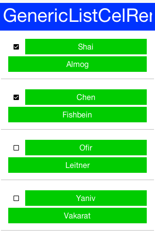
com.codename1.ui.List a list of items, this is a rather elaborate component to work with!
We often
recommend just using com.codename1.ui.Container, com.codename1.ui.InfiniteContainer or
com.codename1.components.InfiniteScrollAdapter
MultiList
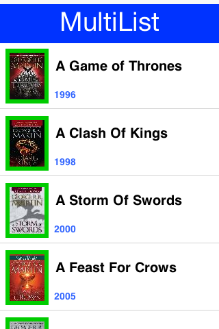
com.codename1.ui.list.MultiList a list that is a bit simpler to work with than List com.codename1.ui.List although
our recommendation to use something else still applies
Slider

com.codename1.ui.Slider allows us to indicate progress or allows the user to drag a bar to
indicate
volume (as in quantity)
SwipeableContainer
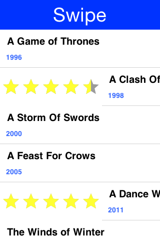
com.codename1.ui.SwipeableContainer enables side swipe gesture to expose additional
functionality
Tabs
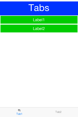
com.codename1.ui.Tabs places components/containers into tabbable entries, allows swiping
between choices thru touch
Carousel
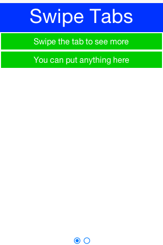
com.codename1.ui.Tabs can also be used as a swipe carousel
TextArea/Field
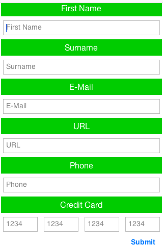
com.codename1.ui.TextArea & com.codename1.ui.TextField allow for user input
via
the keyboard (virtual or otherwise)
TextComponent
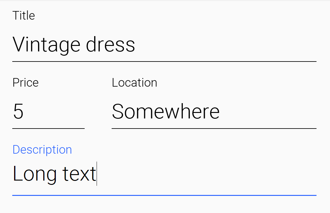
com.codename1.ui.TextComponent & com.codename1.ui.PickerComponent wrap the
text field and picker respectively and adapt them better to iOS/Android conventions
Table
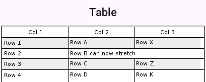
com.codename1.ui.table.Table displays optionally editable tabular data to the user
Tree
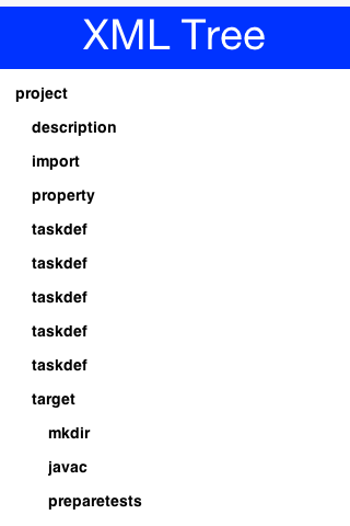
com.codename1.ui.tree.Tree displays data in a tree like hierarchy
ChartComponent
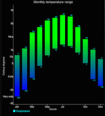
com.codename1.charts.ChartComponent can embed a wide range of visualization aids and
animations into your app
ImageViewer

com.codename1.components.ImageViewer swipe, pinch to zoom and pan images
InfiniteProgress
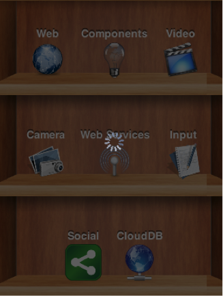
com.codename1.components.InfiniteProgress provides a constantly spinning component
InteractionDialog
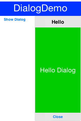
com.codename1.components.InteractionDialog an “always on top” com.codename1.ui.Dialog
used for non-form modal UI patterns. You can make static Dialog.show(...) use
InteractionDialog by default with the theme constant defaultInteractionDialogModeBool
or via com.codename1.ui.Dialog#setDefaultInteractionDialogMode(boolean).
MediaPlayer
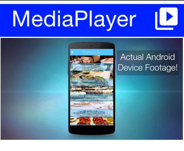
com.codename1.components.MediaPlayer allows playing media including video coupled with the
com.codename1.media.MediaManager
MultiButton

com.codename1.components.MultiButton is much more than a button
OnOffSwitch
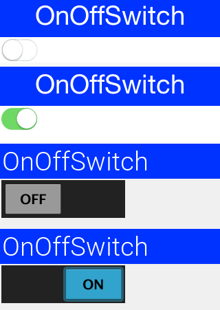
com.codename1.components.OnOffSwitch allows us to toggle a state similar to the com.codename1.ui.CheckBox
but with a more modern look
ShareButton
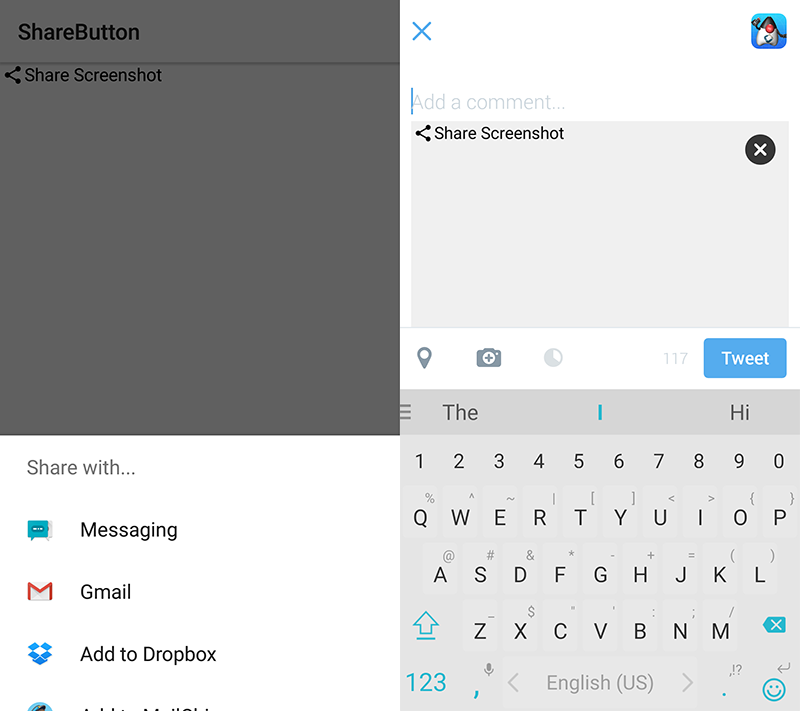
com.codename1.components.ShareButton provides native “social share” functionality
SpanLabel

com.codename1.components.SpanLabel a text label that “seamlessly” breaks lines
SpanButton
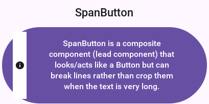
com.codename1.components.SpanButton a button that “seamlessly” breaks lines
Picker (Date)
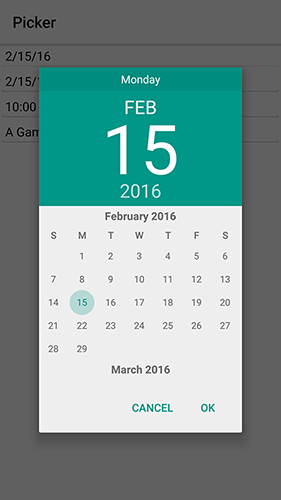
com.codename1.ui.spinner.Picker allows us to show an OS native picker UI (Date Picker)
Picker (Time)
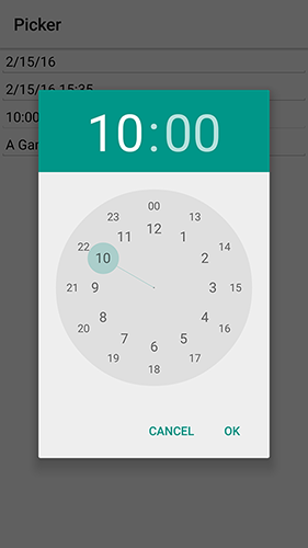
com.codename1.ui.spinner.Picker allows us to show an OS native picker UI (Time Picker)
ToastBar
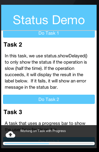
com.codename1.components.ToastBar shows a non-obtrusive notice on the bottom of the Form
SignatureComponent
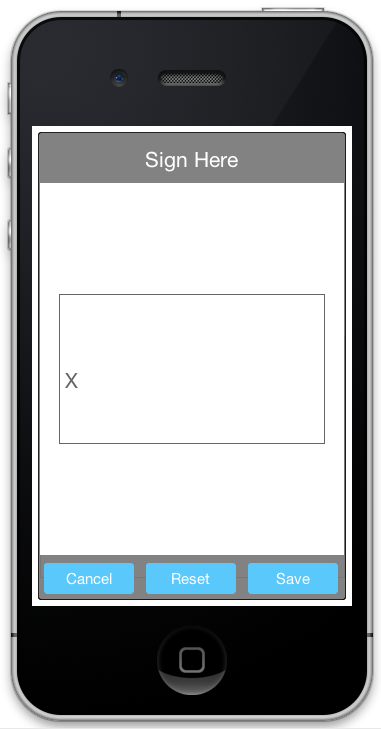
com.codename1.components.SignatureComponent shows a dialog that allows the user to “sign”
using the touch screen
Accordion
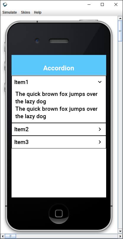
com.codename1.components.Accordion displays collapsible content panels
FloatingHint
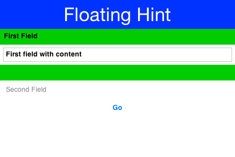
com.codename1.components.FloatingHint animates the text field hint into a label on top of
the text field and visa versa
FloatingActionButton
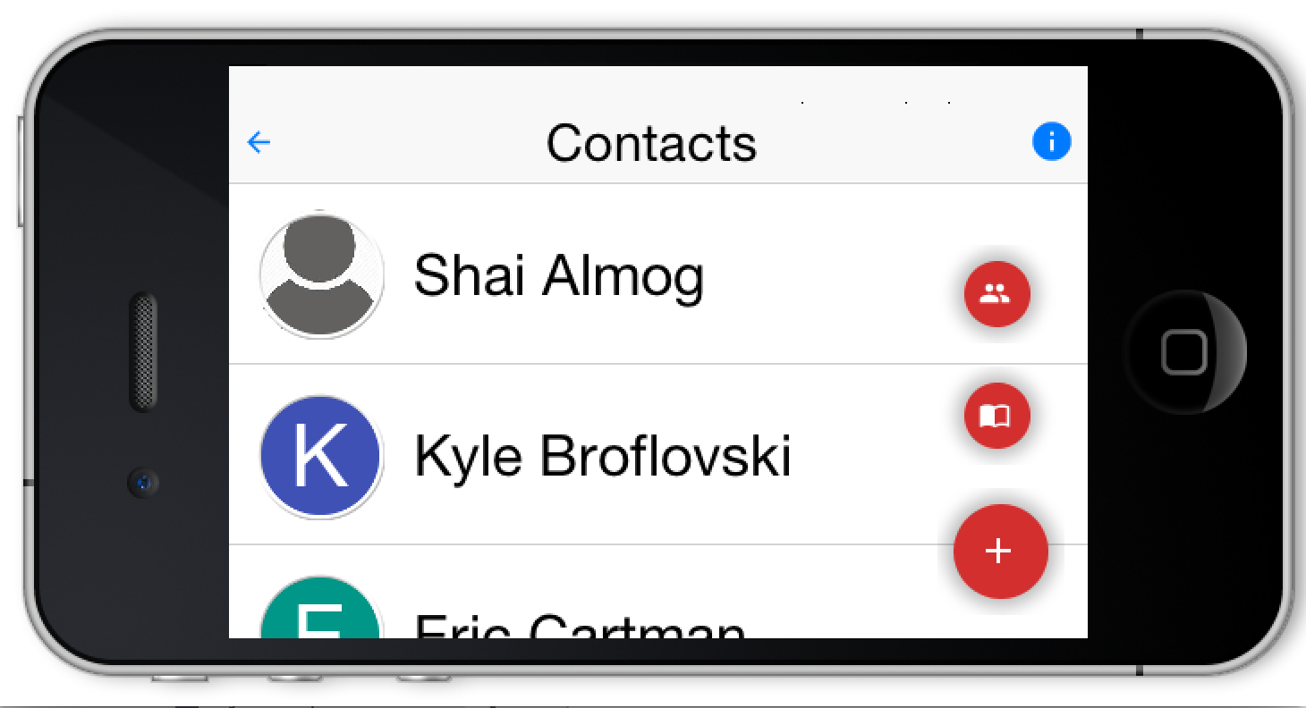
com.codename1.components.FloatingActionButton hovers over the UI presenting a default
action
Types
interface AbstractDialog | Shared dialog contract for Dialog and InteractionDialog. |
class AbstractEditorComponent | Base class for the pure Codename One visual editors (rich text and code). |
enum AccessibilityColorVisionDeficiency | Describes a color-vision deficiency selected in the operating system or simulated by the Java SE simulator. |
class AnimationManager | Animation manager concentrates all of the animations for a given form into a single place that allows us to manage all mutations to a Form in a way the prevents collisions between mutations. |
class AutoCompleteTextComponent | A TextComponent version of com.codename1.ui.AutoCompleteTextField |
class AutoCompleteTextField | An editable com.codename1.ui.TextField with completion suggestions that show up in a drop down menu while the user types in text. |
class BlockingDisallowedException | Exception that is thrown if attempting to run invokeAndBlock while blocking is disabled. |
class BrowserComponent | The browser component is an interface to an embeddable native platform browser on platforms that support embedding the native browser in place, if you need wide compatibility and flexibility you should check out the HTMLComponent which provides a lightweight 100% cross platform web component. |
class BrowserWindow | Encapsulates a WebView that is contained in its own separate window when run on a Desktop (e.g. Simulator). |
class Button | Button is the base class for several UI widgets allowing clickability. |
class ButtonGroup | This class is used to create a multiple-exclusion scope for com.codename1.ui.RadioButton. |
class CN | This is a global context static class designed for static import, this class allows us to write more terse code. |
class CN1Constants | Common constants for Display and CN |
class CSSColor | Parses the CSS color forms into a packed 0xAARRGGBB integer: #rgb, #rgba, #rrggbb, #rrggbbaa, rgb(...) / rgba(...) with integer or percentage components, and the CSS named-color subset. |
class Calendar | Date widget for selecting a date/time value. |
class CheckBox | CheckBox is a button that can be selected or deselected and displays its state to the user. |
class ClipboardContent | A set of alternative clipboard representations keyed by MIME type. |
interface ClipboardDataProvider | Produces a clipboard or drag-and-drop representation on demand, so a payload that is expensive to build is only built if something actually asks for it. |
class CodeCompletion | A single code completion proposal returned by a CodeCompletionProvider and shown in the CodeEditor completion popup. |
interface CodeCompletionProvider | Supplies IDE style code completion proposals to a CodeEditor. |
class CodeDiagnostic | A diagnostic (error / warning / information) shown in a CodeEditor as a squiggly underline over a source range, a marker in the line-number gutter and a tooltip carrying the message. |
class CodeEditor | An IDE style source code editor with syntax highlighting, a line-number gutter and asynchronous code completion. |
class ComboBox | A ComboBox is a list that allows only one selection at a time, when a user clicks the ComboBox a popup button with the full list of elements allows the selection of a single element. |
class Command | The Command class provides a useful extension to the ActionListener interface in cases where the same functionality may be accessed by several controls. |
class CommonProgressAnimations | A collection of useful progress animations and utility methods. |
class Component | The component class is the basis of all UI widgets in Codename One, to arrange multiple components together we use the Container class which itself “IS A” Component subclass. |
class ComponentGroup | A component group is a container that applies the given UIID to a set of components within it and gives the same UIID with “First”/“Last” prepended to the first and last components. |
class ComponentImage | A utility wrapper that allows a Component to be used as an Image so that it can be set as the icon for a Label or button. |
class ComponentSelector | A tool to facilitate selection and manipulation of UI components as sets. |
class ConicGradient | Conic (sweep) gradient. |
class Container | A composite pattern with Component, allows nesting and arranging multiple components using a pluggable layout manager architecture. |
class Desktop | The desktop a windowed application runs on: the monitors attached to it and the Window instances open on them. |
class DevicePosture | Describes the physical fold posture of a foldable or dual screen device such as a Galaxy Fold, Galaxy Flip, Pixel Fold or Surface Duo. |
class Dialog | A dialog is a form that occupies a part of the screen and appears as a modal entity to the developer. |
class Display | Central class for the API that manages rendering/events and is used to place top level components (Form) on the “display”. |
class DynamicImage | A base class for images that dynamically painted, just like a normal component. |
class EditField | A pure Codename One text field. |
interface Editable | An interface that can be implemented to provide editing capabilities for any component in the UI. |
class EncodedImage | EncodedImage is the workhorse of Codename One. |
class Font | Codename One currently supports 3 font types: |
class FontImage | FontImage allows using an icon font as if it was an image. |
class Form | Top level component that serves as the root for the UI, this Container subclass works in concert with the Toolbar to create menus. |
class GeneratedSVGImage | Base class for SVG images emitted by the build-time transcoder (maven/svg-transcoder). |
class Gradient | Abstract description of a CSS-style gradient that can be used as a background or painted directly via Graphics#fillGradient. |
class Graphics | Abstracts the underlying platform graphics context thus allowing us to achieve portability between MIDP devices and CDC devices. |
interface IconHolder | An interface implemented by Component classes that can display an icon. |
class Image | Abstracts the underlying platform images allowing us to treat them as a uniform object. |
class ImageFactory | A factory class for creating mutable images. |
class InfiniteContainer | This abstract Container can scroll indefinitely (or at least until we run out of data). |
class InputComponent | A base class for com.codename1.ui.TextComponent, com.codename1.ui.PickerComponent and potentially other components that wish to accept input in a dynamic way that matches iOS and Android native input guidelines. |
class InterFormContainer | A container that allows you to use the same component on multiple forms. |
class Label | Allows displaying a single line of text and icon (both optional) with different alignment options. |
class LinearGradient | Multi-stop linear gradient at an arbitrary angle. |
class LinearGradientPaint | LinearGradientPaint provides a way to fill a Shape with a linear gradient. |
class List | A set of elements that is rendered using a com.codename1.ui.list.ListCellRenderer and are extracted via the com.codename1.ui.list.ListModel, notice that we strongly discourage usage of lists. |
class MenuBar | This class represents the Form MenuBar. |
class Monitor | One physical display attached to the desktop. |
class MultipleGradientPaint | A base class for Paints that use multiple gradients. |
class NativeDragAndDrop | Drag and drop through the operating system rather than inside the application. |
class NativeDragOperation | Everything the operating system needs in order to drag something out of a Codename One component: what is being dragged, what the receiver is allowed to do with it, and what the user should see under the cursor while dragging. |
class NativeDropEvent | One step of a native operating system drag passing over, or landing on, a component that was marked as a native drop target with Component#setNativeDropTarget(boolean). |
class NavigationCommand | The NavigationCommand is a Command that navigates to a given Form. |
interface Paint | An interface for providing custom painting such as gradients. |
interface Painter | Painter can be used to draw on components backgrounds. |
class PeerComponent | A peer component is essentially a “dummy” Codename One component used to calculate the position of the actual native platform specific component. |
class PickerComponent | A picker component similar to com.codename1.ui.TextComponent that adapts to native UI conventions and leverages the com.codename1.ui.spinner.Picker API. |
class RGBImage | An image that stores its data as an integer RGB array internally, this image cannot be manipulated via Graphics primitives however its array is accessible and modifiable programmatically. |
class RadialGradient | Multi-stop radial gradient with CSS shape / extent / center / radius support. |
class RadioButton | RadioButton is a Button that maintains a selection state exclusively within a specific ButtonGroup. |
interface ReleasableComponent | An Interface that any Component that could be released from the parent Form can implement. |
class RichTextArea | A native visual editor for rich text / HTML content (a WYSIWYG editor). |
class RichTextClipboardData | Clipboard content with both a plain-text fallback and optional rich representations. |
class RichTextComponent | A read-only component that renders multi-styled, word-wrapped rich text: headings, bold / italic / underline / strike, inline code, colored and highlighted spans, per-paragraph alignment and indentation, ordered and unordered lists, block quotes, preformatted blocks, inline images and tappable hyperlinks. |
enum RichTextFormat | Input formats understood by RichTextArea. |
interface SelectableIconHolder | An interface that is implemented by “selectable” components that hold icons, such as Button, SpanButton, MultiButton, etc… |
class Sheet | A light-weight dialog that slides up from the bottom of the screen on mobile devices. |
class SideMenuBar | This is Menu Bar that displays it’s commands on a side bar navigation similar to Google+/Facbook apps navigation |
class Slider | The slider component serves both as a slider widget to allow users to select a value on a scale via touch/arrows and also to indicate progress. |
class Stroke | Encapsulates the stroke used for drawing paths. |
class SwipeableContainer | SwipeableContainer allows us to side swipe a component and expose underlying configuration within it. |
class Tabs | A component that lets the user switch between a group of components by clicking on a tab with a given title and/or icon. |
class TextArea | An optionally multi-line editable region that can display text and allow a user to edit it. |
class TextComponent | Encapsulates a text field and label into a single component. |
class TextComponentPassword | TextComponent extended to automatically add mask/unmask password button near the TextField; it acts like a normal TextComponent if the Constraint is not TextArea.PASSWORD |
class TextField | A specialized version of com.codename1.ui.TextArea with some minor deviations from the original specifically: |
interface TextHolder | An interface implemented by Component classes that can support setting/getting text. |
interface TextInputClient | A low level text input client, the counterpart to a platform text input source (soft keyboard, IME, autocorrect and hardware keyboard). |
class TextInputConfig | Immutable configuration handed to the platform when a TextInputClient binds to the low level text input source (see com.codename1.impl.CodenameOneImplementation#startTextInput). |
class TextInputState | An immutable snapshot of the editing state shared between a TextInputClient and the platform text input source. |
class TextSelection | Text selection support for Codename One applications. |
class Toolbar | Toolbar replaces the default title area with a powerful abstraction that allows functionality ranging from side menus (hamburger) to title animations and any arbitrary component type. |
class TooltipManager | Central management for tooltips, this class can be derived/customized to override the default tooltip behavior. |
interface TopLevelContainer | The contract shared by the two things that can sit at the root of a Codename One component hierarchy: Form, which fills the application’s main surface, and Window, which is a separate native operating system window on the desktop. |
class Transform | Encapsulates a 3D transform that can be used in com.codename1.ui.Graphics contexts or with com.codename1.ui.geom.Shapes to transform in various ways. |
class UIFragment | Encapsulates an XML or JSON template for a UI component hierarchy. |
class URLImage | URLImage allows us to create an image from a URL. |
interface VirtualInputDevice | Represents a virtual input device that may need to be closed/disposed, providing a way Widgets that require exclusive access to the user’s input (but perhaps not all of the user interactions with the app) need to provide a way for the form to dispose of it when a new input device needs to be displayed. |
class Window | A separate native operating system window, with its own Codename One component hierarchy inside it. |